
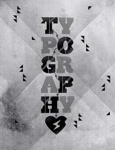
Read This Before Your First Typography Project –

 Before you start saying, “Oh no, the crazy lady is talking about typography again,” let me remind you how important this subject can be. I can agree that not everyone gets as excited as I do about typography, but in some cases, it can make or break your project. With that in mind, let’s talk about a few things to keep in mind before you start your first typography project.
What is Typography?
Very simply, typography is the act of setting type in your project and the techniques you use to do so. It is not only the words that are used that are important to any project. It’s also the way those words look in the finished work. Are they readable? Are they well-placed? Is the point of the work clear to everyone who looks at it? Well-done typography will allow you to answer “yes” to all of these questions.
Choose Your Typeface
There are so many fonts and sizes available to choose from that it can sometimes be overwhelming. It is OK to have a few favorites, typefaces that work in most situations, but don’t get hung up. Branch out when the project calls for something different, and rely on your standby the rest of the time. Many awesome fonts are free, but there are some great paid fonts out there, too. I think it is important to remember what message you are trying to impart when you are choosing the style of your letters.
Make It Legible
Your message will be lost if people can’t read what you have put in print. Look at your layout and make sure that your font choice won’t be lost in the background. If it is too small or the wrong color, I will have to work to hard to read it. That will most likely mean that I won’t bother to read it at all. The other side of that is making your font too big or too busy. I don’t want your typography project to hurt my eyes. One of the most important aspects of typography is to catch the reader’s eye without chasing it away.
Measure and Align
Make sure, as you lay out your design, to measure the width of your text, not just the size of the font. Then decide how you plan to align the text. The proper measurement and alignment will let the readers’ eyes travel comfortably over the page. You want to avoid excessive moving of the head or eyes for ease of reading. There is no real formula to help you select measurement and alignment, so look at your work as you are completing it. Making sure it works for your eyes will give you a better idea of how it will look to your readers.
Color
Choose your colors carefully. Complimentary colors are the most easily readable. Subtle colors can get lost in the overall look of your typography project. If your project will be a print piece, as opposed to a website, try a test run for color. You will need to see how the colors you choose will appear in a larger format.
In the end, the best advice I could give you as a typography newbie is to be fearless. Try different combinations of fonts, sizes, and colors. Don’t be afraid to think outside of the box. If you don’t like the end result, you can always start over. And don’t be afraid to start over; experimenting with the individual components will give you more chances to get the results you were hoping for.