April 28, 2014

By Janelle Sullivan
 Have you ever known anyone with color blindness? I have a relative who has this problem and I must admit I used to tease him when we were kids. I didn’t understand why he didn’t see colors the same way I did, I just thought he hadn’t learned his colors. Of course, I feel bad as an adult for the teasing, but now I understand more than I did back then. Although I do not suffer from color blindness, I realized that many of my typography projects had the potential to be viewed by people who do have this affliction. I had to find ways to be sure they could perceive my work as it was intended. Have you ever known anyone with color blindness? I have a relative who has this problem and I must admit I used to tease him when we were kids. I didn’t understand why he didn’t see colors the same way I did, I just thought he hadn’t learned his colors. Of course, I feel bad as an adult for the teasing, but now I understand more than I did back then. Although I do not suffer from color blindness, I realized that many of my typography projects had the potential to be viewed by people who do have this affliction. I had to find ways to be sure they could perceive my work as it was intended.
What is Color Blindness?
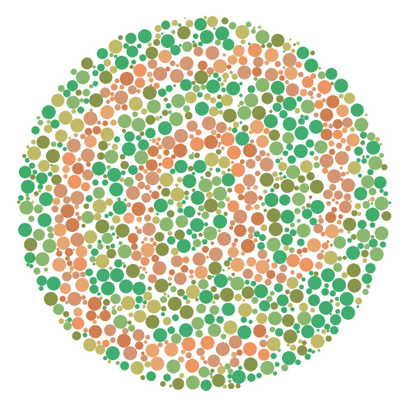
Color blind people do see colors; they do not usually see the world in shades of gray. Color blindness is the inability to distinguish certain colors, or the differences between colors. This is the result of a lack of color pigment in the cones of the retina of the eye. A person who is color blind may have trouble seeing red and green, or blue and purple. Depending on the severity of the color blindness, these colors may even look the same to a color blind individual. You do not get color blindness; you are born with it, and most likely inherited it. More men than woman are color blind and it is a fairly common occurrence – 1 in 12 for men and 1 in 20 for women. There is a very small group of people who suffer from red monochromacy or achromacy. This rare type of color blindness leads to seeing the world in gray and black because the cones in the retina do not work at all.
(more…)
April 23, 2014
By Janelle Sullivan
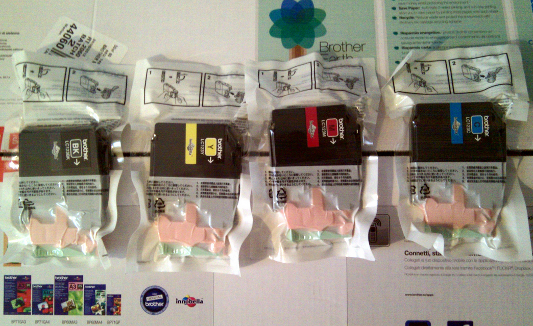 Oh, great: The scammers are at it again. It seems like every time I turn around, there is a warning about some scam artist and the many ways they are trying to steal my money. I have news for you guys: I work hard for my money, and you can’t have it! The latest is a little gem called the “phoner toner scam,” and the ruse is to rip you off while convincing you they are giving you a great deal on printer ink. Read on to find out some tips for protecting yourself from this and other similar scams. Oh, great: The scammers are at it again. It seems like every time I turn around, there is a warning about some scam artist and the many ways they are trying to steal my money. I have news for you guys: I work hard for my money, and you can’t have it! The latest is a little gem called the “phoner toner scam,” and the ruse is to rip you off while convincing you they are giving you a great deal on printer ink. Read on to find out some tips for protecting yourself from this and other similar scams.
What Is It?
The phoner toner scam is successful quite often and can cost you thousands of dollars, depending on the size of your company. A caller will phone the office and behave as though they have been doing business with you for a long time. They may ask for the serial number on your copy equipment, just for verification. Once you have given them this information, they can find out what equipment you are using. A good scam artist will take this info and tell you all about a great price on your specific printer ink and copier toner. Next thing you know, you will receive a large shipment of printing products that you never ordered. This will not be a great deal: Instead, they will be overpriced, cheap-quality products that you never wanted. The phoner toner scam relies on the invoice being paid before the realization that you are being ripped off hits.
(more…)
April 17, 2014
By Janelle Sullivan
We’re excited to announce we’ve launched a new inforgraphic entitled,”The Science of Ink“. There is more to the ink we use everyday than meets the eye.
Connect with Janelle
So Who is Janelle Sullivan Anyway?
Twitter
Facebook
Google+
April 16, 2014
By Janelle Sullivan
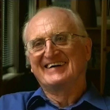
On February 24, 2014, Mike Parker, the man, the legend, passed away. I am sure that many of you have never even heard of this man, but to me, Mike Parker fit the bill to be called a legend in his own time. If you are a type designer or typographer, you are well aware of this man’s work, even if you don’t realize it. I would like to take a few moments to pay tribute to this man.
Who was Mike Parker?
Born in London in 1929, Mike Parker was the son of a geologist. He hoped to follow in his father’s footsteps, but he was colorblind, and this stood in the way of fulfilling his dream. He went to Yale and graduated with an architecture degree as well as a master’s degree in design. Fresh out of college, he became assistant and heir to the director of Mergenthaler Linotype Company. Parker’s job here was to establish a library of typefaces that customers could choose from. He did so much more: He developed in excess of 1,000 types to add to the library, and his success followed him. He discovered a type that had been designed but was unavailable for linotype. It was called Helvetica. In 1981, digital media was changing the face of printing, so Mike Parker moved with the times and co-founded Bitstream. This company was the first of its kind, offering digital typefaces that were licensed for use by everyone. (more…)
April 14, 2014
By Janelle Sullivan
I love to save money — don’t you? With the economy being what it is, I find myself using more coupons and paying more attention to what is on sale. I think many people find themselves in that same situation. Wouldn’t it be great if we could find a way to save money with little effort involved? And if those savings could translate to money saved by businesses everywhere and even the government? Well, a middle-school student by the name of Suvir Mirchandani has found a way for that to happen.
Who Is He?
Suvir Mirchandani is a middle-school student at Dorseyville Middle School in Pittsburgh, Pennsylvania. The 14-year-old sixth-grader is interested in applying computer science to promote environmental sustainability. While this might seem like a lofty idea for such a young student, Suvir was up to the challenge. The increased number of handouts he was receiving in class prompted this incredible science fair project. Suvir was aware, as most of us are, of the importance of recycling. Most schools and government agencies do use paper made of recycled products, so he turned his attention to printer ink and toner cartridges.
(more…)
April 9, 2014
By Janelle Sullivan
Batkid Takes Media By Storm
We are excited to announce our new infographic entitled “Batkid Takes Media By Storm” has been published!
Please click the image below to view the full infographic:

Connect with Janelle
So Who is Janelle Sullivan Anyway?
Twitter
Facebook
Google+
April 1, 2014
By Janelle Sullivan
I recently had the pleasure of interviewing the incredibly talented designer and artist Kristian Bjørnard. Already a prominent name in graphic design and publishing, Kristian and his design studio, The Office of Kristian Bjørnard, continue to grow in popularity and so do its impressive catalog of projects. Those of you who might not have already heard of him, get ready, because you will.Kristian’s education accomplishments include an MFA in Graphic Design from the Maryland Institute College of Art and a BA in Studio Art from the Kalamazoo College. Currently Kristian is the inaugural Bunting Teaching Fellow in Graphic Design where he once studied at the Maryland Institute College of Art (MICA).
Kristian is passionate about true sustainability or post-environmentalism as a concept and lifestyle and has even taken it to the next level by incorporating it into his work and coining the term: Sustainabilitism. In coordination with his design studio, Kristian is researching sustainable graphic design, and new print and digital publishing tools. Further principles of sustainabilitism are detailed on his website, The Sustainabilitist. |
 Kristian Bjornard: Designer, Thinker, Educator, Sustainabilitist Kristian Bjornard: Designer, Thinker, Educator, Sustainabilitist |
1) Having looked through some of the designs featured in your portfolio on Kristian.Bjornard.com and on OOKB.co, it’s clear you’re incredibly talented at what you do. After receiving your bachelor’s and master’s degrees in art, I understand your interest in mathematics and physics almost led you to a career in engineering. What can you tell us about when you discovered graphic design and decided to pursue it as a career?
I hadn’t intended on becoming a graphic designer, it is something that ended up happening once I started trying to find work. In fact, I didn’t quite realize it was an actual “job.” I would make posters for events in college. I would make covers for mix-tapes and mix-CDs I compiled for friends. I drew things for bands to put on shirts. I even helped a friend of mine typeset the novel he wrote. But I didn’t realize this was all “graphic design.” They all just seemed like fun things to do that lived at the intersections of my interests. I liked playing around with images and text on the computer and I liked big, iconic graphics. The “art” I made in high school and college used these aesthetic stylings and pop-art tropes. Design ended up being something that allowed me to keep doing that, but in more of a professional capacity. Once I realized that, then I got serious about learning what “good” meant in a design context, not just a visual or artistic context.
2) Your studio, the Office of Kristian Bjørnard (OOKB) specializes in publishing, identity design, print, web, letterpress and other design projects for many different clients. After almost a decade in business, do you have a project that stands out above the rest as your favorite or most coveted?
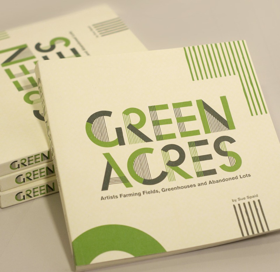
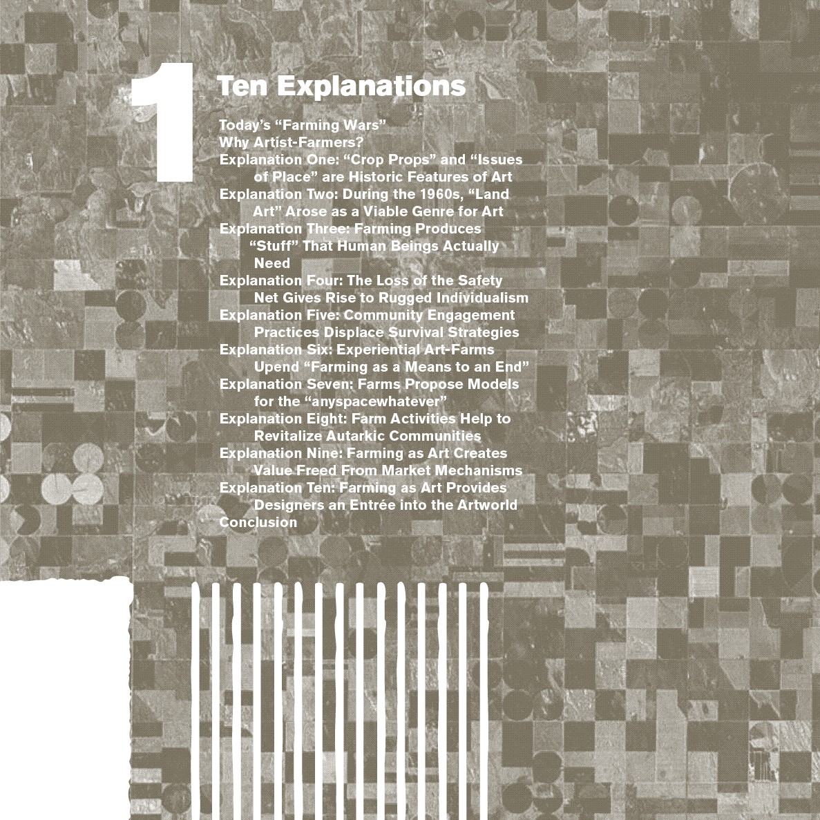
Asking a designer to pick out a favorite project is like asking a parent to pick their favorite kid … but I’ll try. One of my favorite things I’ve made is the book “Green Acres”. I did it with a friend of mine, Sue Spaid, for the Contemporary Arts Center in Cincinnati Ohio. It is a book that goes along with an exhibition that Sue Spaid also curated. It was interesting in that it isn’t a catalog of the work in the exhibition, but an accompanying piece. The exhibition was also called “Green Acres,” and focused on artists that use farming as their artist practice. With that in mind, I did a lot (at least in concept) to bring “farming” into the design of the book itself. For example, the interior page grid references the section lines of surveyed farm land. Graphics based on aerial maps of industrial farmland decorate many of the spreads. This is somewhat ironic as none of the farming-as-art featured in the book takes place on a large-scale. But I thought it was more likely what a person thinking about farming would visualize.
 |
 |
| Above: Cover of Green Acres: Artists Farming Fields, Greenhouses and Abandoned Lots (left) and an example of the design of the book’s interior pages (right). |
(more…)
|
|