March 31, 2014

By Janelle Sullivan
 Have you ever noticed what a strange creature the English language is? There are so many words that sound alike but are spelled differently. Or maybe they are spelled the same but mean entirely different things. There are times when people are so confused by the language that they are unsure what word they should be using. Sometimes, the confusion is in the definition of the word. For many people, “font” and “typeface” are two words that are frequently mixed up, but they do not mean the same thing. Maybe we can figure out why we can’t seem to figure out the difference between these commonly used typography words. Have you ever noticed what a strange creature the English language is? There are so many words that sound alike but are spelled differently. Or maybe they are spelled the same but mean entirely different things. There are times when people are so confused by the language that they are unsure what word they should be using. Sometimes, the confusion is in the definition of the word. For many people, “font” and “typeface” are two words that are frequently mixed up, but they do not mean the same thing. Maybe we can figure out why we can’t seem to figure out the difference between these commonly used typography words.
What is a typeface?
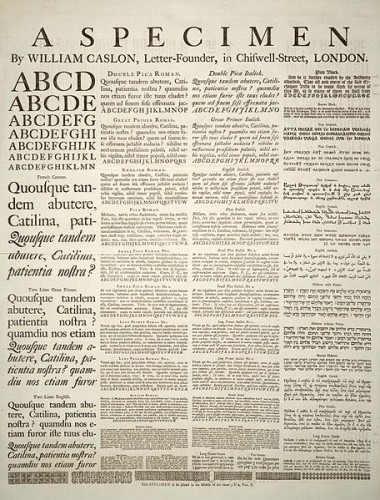
Typographers, or print designers, create a style of letter forms that fit certain criteria. Each letter carries the same characteristics, including the weight of the stroke, shape of finials, and length of the ascenders and descenders. These styles are referred to as a typeface. Some of the common typeface styles that you have probably heard of are Times New Roman, Comic Sans, and Arial. The term “typeface” comes from the old movable type of days gone by. Each individual letter, or block, held a relief image on its face. So in essence, typeface is how something looks.
What is a font?
Just as the word “typeface” has a history, so does the word “font.” This word is derived from a Middle French word, fonte, which means something that has been melted. When moveable type was first introduced, each individual character was created by melting metal and pouring it into a hand mold. So a font is any variation of a typeface. The variation can be in size, bold print, italics, or anything else that changes the look but not the style of the typeface. (more…)
March 25, 2014
By Janelle Sullivan
 Ever since Kindergarten we have heard the terms upper case and lower case letters. We learned at a very young age that upper case letters always started a sentence and should be used when we are writing proper nouns. Lower case letters are what the majority of our writing was comprised of, regular words that fills the pages of our books. This is how we learned to read and write, with this usage in mind. By the time we become adults, this lesson is deeply ingrained in our brains. But did you ever wonder where these terms come from? Ever since Kindergarten we have heard the terms upper case and lower case letters. We learned at a very young age that upper case letters always started a sentence and should be used when we are writing proper nouns. Lower case letters are what the majority of our writing was comprised of, regular words that fills the pages of our books. This is how we learned to read and write, with this usage in mind. By the time we become adults, this lesson is deeply ingrained in our brains. But did you ever wonder where these terms come from?
The Original Alphabet
Originally, the alphabet consisted of only one letter case. All letters were upper case, also called capital letters, large or majuscule letters. Text was written in a well-defined manner, with both upper and lower boundaries, to keep the print uniform in size and easier to read. When the letters were written quickly, they were often smaller in size, with more rounded edges. These smaller letters were often outside of the boundaries on a written page, usually dipping below the line. This lead to a distinction between upper case and lower case letters, also known as small or minuscule letters. Many cultures adopted a style of alphabet with large and small letters, each having their own rules about how to use them.
(more…)
March 14, 2014
By Janelle Sullivan
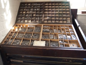
 Type, in its most basic form, has been around since the early days of humanity. Written communication began with symbols that were used to represent an event or an item. For many of us, hieroglyphics come to mind when we think of the original written text, but cave paintings were in existence far earlier. Cave drawings gave way to pictograms and led to typeface as we know it now. The history is far-reaching and pretty interesting. I thought you might like to explore a little of it with me. Type, in its most basic form, has been around since the early days of humanity. Written communication began with symbols that were used to represent an event or an item. For many of us, hieroglyphics come to mind when we think of the original written text, but cave paintings were in existence far earlier. Cave drawings gave way to pictograms and led to typeface as we know it now. The history is far-reaching and pretty interesting. I thought you might like to explore a little of it with me.
The Alphabet
The original alphabet can be traced back to the Phoenicians, who developed a set of symbols to represent spoken sounds. The Greeks adapted this alphabet and then developed the fine art of handwriting. Many years later, the Romans used the Greek alphabet as the basis for the uppercase alphabet that we use today. Several styles of handwriting came about, and they were used for different purposes. Some styles were more refined than others, and these were used for important works, while the more informal styles were used for more mundane purposes. Books were born at this time, and they were only available to the wealthy. I am so glad that history has changed that fact! (more…)
March 10, 2014
By Janelle Sullivan
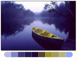 There is a wide variety of Web tools available for use when you are planning the color palette for your next project. You may have a color scheme in your mind before you start, or you may not have a clue what direction you want to head in. Either way, I have found these web tools to be invaluable when I am trying out new color schemes or I am doing a job for someone with an unusual plan for a color scheme. I hope you find them to be helpful, too. There is a wide variety of Web tools available for use when you are planning the color palette for your next project. You may have a color scheme in your mind before you start, or you may not have a clue what direction you want to head in. Either way, I have found these web tools to be invaluable when I am trying out new color schemes or I am doing a job for someone with an unusual plan for a color scheme. I hope you find them to be helpful, too.
Color Blender
 Color Blender is an easy-to-manipulate tool that can help you choose color schemes for almost any purpose. You might be creating a typography project, planting a flower garden, or painting your bedroom. Whatever you are planning, this tool allows you to select a color and automatically get a color palette of complementary and contrasting colors. (more…) Color Blender is an easy-to-manipulate tool that can help you choose color schemes for almost any purpose. You might be creating a typography project, planting a flower garden, or painting your bedroom. Whatever you are planning, this tool allows you to select a color and automatically get a color palette of complementary and contrasting colors. (more…)
March 5, 2014
By Janelle Sullivan
 Before you start saying, “Oh no, the crazy lady is talking about typography again,” let me remind you how important this subject can be. I can agree that not everyone gets as excited as I do about typography, but in some cases, it can make or break your project. With that in mind, let’s talk about a few things to keep in mind before you start your first typography project. Before you start saying, “Oh no, the crazy lady is talking about typography again,” let me remind you how important this subject can be. I can agree that not everyone gets as excited as I do about typography, but in some cases, it can make or break your project. With that in mind, let’s talk about a few things to keep in mind before you start your first typography project.
What is Typography?
Very simply, typography is the act of setting type in your project and the techniques you use to do so. It is not only the words that are used that are important to any project. It’s also the way those words look in the finished work. Are they readable? Are they well-placed? Is the point of the work clear to everyone who looks at it? Well-done typography will allow you to answer “yes” to all of these questions. (more…)
|
|

 Have you ever noticed what a strange creature the English language is? There are so many words that sound alike but are spelled differently. Or maybe they are spelled the same but mean entirely different things. There are times when people are so confused by the language that they are unsure what word they should be using. Sometimes, the confusion is in the definition of the word. For many people, “font” and “typeface” are two words that are frequently mixed up, but they do not mean the same thing. Maybe we can figure out why we can’t seem to figure out the difference between these commonly used typography words.