April 16, 2014

By Janelle Sullivan

On February 24, 2014, Mike Parker, the man, the legend, passed away. I am sure that many of you have never even heard of this man, but to me, Mike Parker fit the bill to be called a legend in his own time. If you are a type designer or typographer, you are well aware of this man’s work, even if you don’t realize it. I would like to take a few moments to pay tribute to this man.
Who was Mike Parker?
Born in London in 1929, Mike Parker was the son of a geologist. He hoped to follow in his father’s footsteps, but he was colorblind, and this stood in the way of fulfilling his dream. He went to Yale and graduated with an architecture degree as well as a master’s degree in design. Fresh out of college, he became assistant and heir to the director of Mergenthaler Linotype Company. Parker’s job here was to establish a library of typefaces that customers could choose from. He did so much more: He developed in excess of 1,000 types to add to the library, and his success followed him. He discovered a type that had been designed but was unavailable for linotype. It was called Helvetica. In 1981, digital media was changing the face of printing, so Mike Parker moved with the times and co-founded Bitstream. This company was the first of its kind, offering digital typefaces that were licensed for use by everyone. (more…)
April 14, 2014

By Janelle Sullivan

I love to save money — don’t you? With the economy being what it is, I find myself using more coupons and paying more attention to what is on sale. I think many people find themselves in that same situation. Wouldn’t it be great if we could find a way to save money with little effort involved? And if those savings could translate to money saved by businesses everywhere and even the government? Well, a middle-school student by the name of Suvir Mirchandani has found a way for that to happen.
Who Is He?
Suvir Mirchandani is a middle-school student at Dorseyville Middle School in Pittsburgh, Pennsylvania. The 14-year-old sixth-grader is interested in applying computer science to promote environmental sustainability. While this might seem like a lofty idea for such a young student, Suvir was up to the challenge. The increased number of handouts he was receiving in class prompted this incredible science fair project. Suvir was aware, as most of us are, of the importance of recycling. Most schools and government agencies do use paper made of recycled products, so he turned his attention to printer ink and toner cartridges.
(more…)
March 31, 2014

By Janelle Sullivan
 Have you ever noticed what a strange creature the English language is? There are so many words that sound alike but are spelled differently. Or maybe they are spelled the same but mean entirely different things. There are times when people are so confused by the language that they are unsure what word they should be using. Sometimes, the confusion is in the definition of the word. For many people, “font” and “typeface” are two words that are frequently mixed up, but they do not mean the same thing. Maybe we can figure out why we can’t seem to figure out the difference between these commonly used typography words. Have you ever noticed what a strange creature the English language is? There are so many words that sound alike but are spelled differently. Or maybe they are spelled the same but mean entirely different things. There are times when people are so confused by the language that they are unsure what word they should be using. Sometimes, the confusion is in the definition of the word. For many people, “font” and “typeface” are two words that are frequently mixed up, but they do not mean the same thing. Maybe we can figure out why we can’t seem to figure out the difference between these commonly used typography words.
What is a typeface?
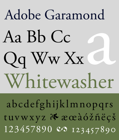
Typographers, or print designers, create a style of letter forms that fit certain criteria. Each letter carries the same characteristics, including the weight of the stroke, shape of finials, and length of the ascenders and descenders. These styles are referred to as a typeface. Some of the common typeface styles that you have probably heard of are Times New Roman, Comic Sans, and Arial. The term “typeface” comes from the old movable type of days gone by. Each individual letter, or block, held a relief image on its face. So in essence, typeface is how something looks.
What is a font?
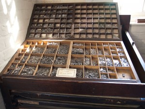
Just as the word “typeface” has a history, so does the word “font.” This word is derived from a Middle French word, fonte, which means something that has been melted. When moveable type was first introduced, each individual character was created by melting metal and pouring it into a hand mold. So a font is any variation of a typeface. The variation can be in size, bold print, italics, or anything else that changes the look but not the style of the typeface. (more…)
March 25, 2014

By Janelle Sullivan
 Ever since Kindergarten we have heard the terms upper case and lower case letters. We learned at a very young age that upper case letters always started a sentence and should be used when we are writing proper nouns. Lower case letters are what the majority of our writing was comprised of, regular words that fills the pages of our books. This is how we learned to read and write, with this usage in mind. By the time we become adults, this lesson is deeply ingrained in our brains. But did you ever wonder where these terms come from? Ever since Kindergarten we have heard the terms upper case and lower case letters. We learned at a very young age that upper case letters always started a sentence and should be used when we are writing proper nouns. Lower case letters are what the majority of our writing was comprised of, regular words that fills the pages of our books. This is how we learned to read and write, with this usage in mind. By the time we become adults, this lesson is deeply ingrained in our brains. But did you ever wonder where these terms come from?
The Original Alphabet
Originally, the alphabet consisted of only one letter case. All letters were upper case, also called capital letters, large or majuscule letters. Text was written in a well-defined manner, with both upper and lower boundaries, to keep the print uniform in size and easier to read. When the letters were written quickly, they were often smaller in size, with more rounded edges. These smaller letters were often outside of the boundaries on a written page, usually dipping below the line. This lead to a distinction between upper case and lower case letters, also known as small or minuscule letters. Many cultures adopted a style of alphabet with large and small letters, each having their own rules about how to use them.
(more…)
|
|


