An Interview with Kristian Bjørnard: Designer, Thinker, Educator, Sustainabilitist. –

I recently had the pleasure of interviewing the incredibly talented designer and artist Kristian Bjørnard. Already a prominent name in graphic design and publishing, Kristian and his design studio, The Office of Kristian Bjørnard, continue to grow in popularity and so do its impressive catalog of projects. Those of you who might not have already heard of him, get ready, because you will.Kristian’s education accomplishments include an MFA in Graphic Design from the Maryland Institute College of Art and a BA in Studio Art from the Kalamazoo College. Currently Kristian is the inaugural Bunting Teaching Fellow in Graphic Design where he once studied at the Maryland Institute College of Art (MICA). Kristian is passionate about true sustainability or post-environmentalism as a concept and lifestyle and has even taken it to the next level by incorporating it into his work and coining the term: Sustainabilitism. In coordination with his design studio, Kristian is researching sustainable graphic design, and new print and digital publishing tools. Further principles of sustainabilitism are detailed on his website, The Sustainabilitist. |
 |
1) Having looked through some of the designs featured in your portfolio on Kristian.Bjornard.com and on OOKB.co, it’s clear you’re incredibly talented at what you do. After receiving your bachelor’s and master’s degrees in art, I understand your interest in mathematics and physics almost led you to a career in engineering. What can you tell us about when you discovered graphic design and decided to pursue it as a career?
I hadn’t intended on becoming a graphic designer, it is something that ended up happening once I started trying to find work. In fact, I didn’t quite realize it was an actual “job.” I would make posters for events in college. I would make covers for mix-tapes and mix-CDs I compiled for friends. I drew things for bands to put on shirts. I even helped a friend of mine typeset the novel he wrote. But I didn’t realize this was all “graphic design.” They all just seemed like fun things to do that lived at the intersections of my interests. I liked playing around with images and text on the computer and I liked big, iconic graphics. The “art” I made in high school and college used these aesthetic stylings and pop-art tropes. Design ended up being something that allowed me to keep doing that, but in more of a professional capacity. Once I realized that, then I got serious about learning what “good” meant in a design context, not just a visual or artistic context.
2) Your studio, the Office of Kristian Bjørnard (OOKB) specializes in publishing, identity design, print, web, letterpress and other design projects for many different clients. After almost a decade in business, do you have a project that stands out above the rest as your favorite or most coveted?
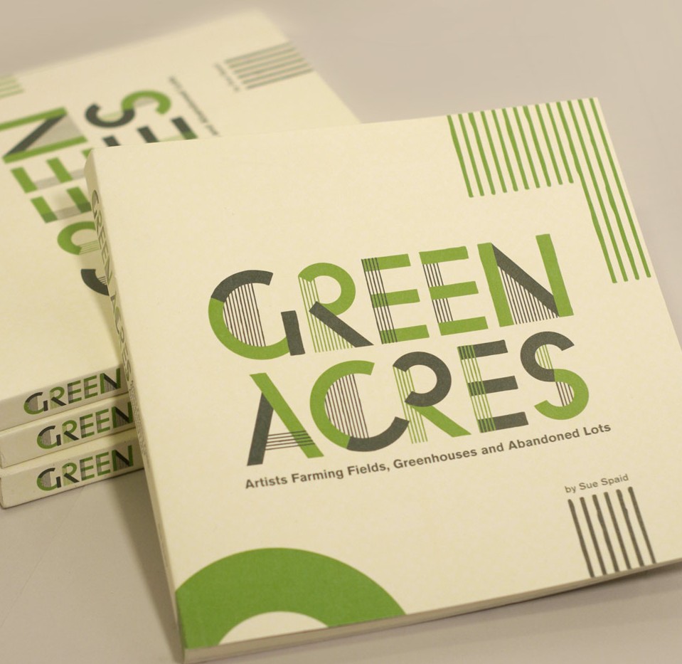
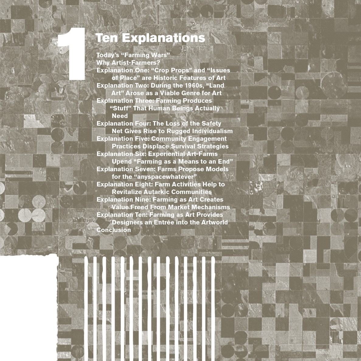
Asking a designer to pick out a favorite project is like asking a parent to pick their favorite kid … but I’ll try. One of my favorite things I’ve made is the book “Green Acres”. I did it with a friend of mine, Sue Spaid, for the Contemporary Arts Center in Cincinnati Ohio. It is a book that goes along with an exhibition that Sue Spaid also curated. It was interesting in that it isn’t a catalog of the work in the exhibition, but an accompanying piece. The exhibition was also called “Green Acres,” and focused on artists that use farming as their artist practice. With that in mind, I did a lot (at least in concept) to bring “farming” into the design of the book itself. For example, the interior page grid references the section lines of surveyed farm land. Graphics based on aerial maps of industrial farmland decorate many of the spreads. This is somewhat ironic as none of the farming-as-art featured in the book takes place on a large-scale. But I thought it was more likely what a person thinking about farming would visualize.
 |
 |