An Interview with Kristian Bjørnard: Designer, Thinker, Educator, Sustainabilitist. –
I recently had the pleasure of interviewing the incredibly talented designer and artist Kristian Bjørnard. Already a prominent name in graphic design and publishing, Kristian and his design studio, The Office of Kristian Bjørnard, continue to grow in popularity and so do its impressive catalog of projects. Those of you who might not have already heard of him, get ready, because you will.Kristian’s education accomplishments include an MFA in Graphic Design from the Maryland Institute College of Art and a BA in Studio Art from the Kalamazoo College. Currently Kristian is the inaugural Bunting Teaching Fellow in Graphic Design where he once studied at the Maryland Institute College of Art (MICA). Kristian is passionate about true sustainability or post-environmentalism as a concept and lifestyle and has even taken it to the next level by incorporating it into his work and coining the term: Sustainabilitism. In coordination with his design studio, Kristian is researching sustainable graphic design, and new print and digital publishing tools. Further principles of sustainabilitism are detailed on his website, The Sustainabilitist. |
 |
1) Having looked through some of the designs featured in your portfolio on Kristian.Bjornard.com and on OOKB.co, it’s clear you’re incredibly talented at what you do. After receiving your bachelor’s and master’s degrees in art, I understand your interest in mathematics and physics almost led you to a career in engineering. What can you tell us about when you discovered graphic design and decided to pursue it as a career?
I hadn’t intended on becoming a graphic designer, it is something that ended up happening once I started trying to find work. In fact, I didn’t quite realize it was an actual “job.” I would make posters for events in college. I would make covers for mix-tapes and mix-CDs I compiled for friends. I drew things for bands to put on shirts. I even helped a friend of mine typeset the novel he wrote. But I didn’t realize this was all “graphic design.” They all just seemed like fun things to do that lived at the intersections of my interests. I liked playing around with images and text on the computer and I liked big, iconic graphics. The “art” I made in high school and college used these aesthetic stylings and pop-art tropes. Design ended up being something that allowed me to keep doing that, but in more of a professional capacity. Once I realized that, then I got serious about learning what “good” meant in a design context, not just a visual or artistic context.
2) Your studio, the Office of Kristian Bjørnard (OOKB) specializes in publishing, identity design, print, web, letterpress and other design projects for many different clients. After almost a decade in business, do you have a project that stands out above the rest as your favorite or most coveted?
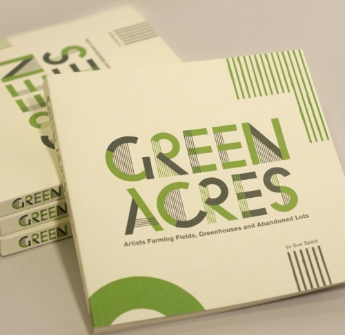
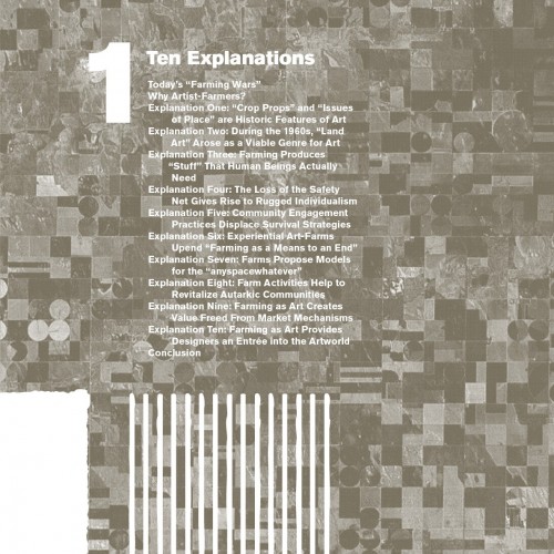
Asking a designer to pick out a favorite project is like asking a parent to pick their favorite kid … but I’ll try. One of my favorite things I’ve made is the book “Green Acres”. I did it with a friend of mine, Sue Spaid, for the Contemporary Arts Center in Cincinnati Ohio. It is a book that goes along with an exhibition that Sue Spaid also curated. It was interesting in that it isn’t a catalog of the work in the exhibition, but an accompanying piece. The exhibition was also called “Green Acres,” and focused on artists that use farming as their artist practice. With that in mind, I did a lot (at least in concept) to bring “farming” into the design of the book itself. For example, the interior page grid references the section lines of surveyed farm land. Graphics based on aerial maps of industrial farmland decorate many of the spreads. This is somewhat ironic as none of the farming-as-art featured in the book takes place on a large-scale. But I thought it was more likely what a person thinking about farming would visualize.
 |
 |
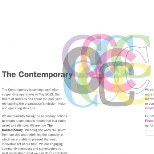
I’m also evolving a new identity for The Contemporary. The Contemporary is a contemporary art museum in Baltimore. I’ve been working with them for several years now, but we only recently “re-branded.” The identity is still a little bit influx due to the way that we work together, and due to their nomadic, ethereal nature — but I like that. The identity is a combinatorial system, and I am still deciding exactly what the rules are for creating the final “logos.” I’m looking forward to continuing work on the Contemporary as the ideas behind it mark an interesting new direction for where design projects can go.
 |
 |
Above: A new logo as part of The Contemporary’s re-branding (left) and an example of the website’s new design (right). |
|
3) To quote the Maryland Institute College of Art (MICA), your “current design research revolves around sustainability and re-usable systems.” What can you tell us about “sustainable graphic design” and what it does it mean to you and your studio?
I’m still trying to figure out what “sustainable graphic design” means in application. My current definition is “design that helps sustain the things I find important.” Sustainable graphic design needs to be honest, authentic, and transparent to all content it conveys. Materials and methodologies must be evaluated. A sustainable designer should apply their skills in ways that helps improve the world around them. This is easier in theory than in practice. Work and definitions around these ideas are always evolving. I’m figuring out better ways to integrate this into discussions with clients about what work to make in the first place.
Something I like to focus on from a sustainability standpoint are “systems.” Sustainable design systems are typically about efficiencies of time, money, and materials — whatever the required resources. From a broader systems view I like to think about the interconnectedness of a new project or new idea to my previous ones.
4) As a Graphic Design professor at MICA and the founder and owner of OOKB, it’s safe to say you’ve been exceptionally successful in your field. What advice do you have for young people who are interested in a career in graphic design?
Having not attended a design program in college, I had a different start into the design field than most. But the most important thing once I decided that what I wanted was to be a “designer” was just to do it no matter what. I did any little design job that came my way. I worked hard. I looked at as many things as I could. I read any book on design and typography I could find. I talked to any person I met related to the design field. Once I had good rapport with a few designers, I (nicely) emailed and called them until they would meet for a portfolio review. In the end that paid off, and I got a job designing books and magazines with a little place called Zindren Design. The main thing it took was just not getting discouraged. In the beginning I didn’t have any design work in my portfolio. I was going to interviews with just paintings and photographs trying to convince people I could make logos and layouts. It didn’t go well at first. As I got more projects, my portfolio got better, I got better at talking about my work, and everything worked out in the end. If I had let that first year or two discourage me, I guess I’d be a landscaper or kitchen appliance salesman now instead (both jobs I had for a short stints early on in life).
5) Besides art and design, what other interests or hobbies do you have?
I so wanted to be a musician. Music is something that is important to me still, but it is more in the listening to music now rather than the writing and playing of it. My research in the realm of sustainability has made me pretty interested in philosophy — thinking about how our actions and choices affect our lives and world, and what the morality of all that is. I am also an avid home-chef. I love cooking and playing around in the kitchen. I find making up food dishes a lot like designing — that’s part of what makes it enjoyable.
6) When printing a design project, what recommendations do you have to ensure the project comes out looking just as vibrant and crisp as the finished product on your computer screen?
That’s tough. The best bet is to be able to get whatever you are working on test printed with the method for printing the final. This isn’t always possible — but makes knowing things are going to look right much more foolproof. The next best is to at least print it out at all — especially if it involves photography. Text and simple graphics will still look pretty good even if colors or darknesses are off, but a little shift one way or another on a photo can ruin it. Blindly relying on what you see on screen is a crap shoot.
7) For an amateur designer, student or graphic design enthusiast who is just starting out, what type of printer would you recommend for them to showcase their completed work? How about toner?
So often now you just submit PDFs of work for interview/portfolio reviews — and even to clients as their “job” files. But a plain old black laser printer always comes in handy. I sometimes lease a 4-color laser printer when I am working on a big project so I can make proofs (I don’t have one all the time, because I do so much web-only work now). I use whatever toner the company I lease from recommends — though I do ask them for the most “eco-friendly” option. However, I regret being ignorant about what exactly that means.
8) What advice do you have for a digital artist or designer that might not have access to more sophisticated methods or equipment such as a printing press?
If you know you will not be able to do anything fancy or complicated, that is a pretty good constraint. You can do a lot still without access to expensive tools or presses. Plain black toner on colored paper is an easy way to make something look “special” while still being cheap and easy to make anywhere. I do a lot of things just with a plain laser printer or photo-copier. You can’t use full-bleed or complicated cross-spread graphics printing this way. So, I just accept that, and then that makes it easier to ensure that everything lines up with minimal frustration or disappointment when self-folding a pile of books. The biggest thing is to design for the printing method. If you know in advance that you have limited options, you can make design choices based on getting the most out of that device, method or constraint. That’s just good advice no matter what.
Don’t forget to visit his websites! Kristian.Bjornard, OOKB, and The Sustainabilitist
To connect with Kristian he can be found on Twitter @bjornmeansbear

