Printing, Toner and Understanding Color Blindness –
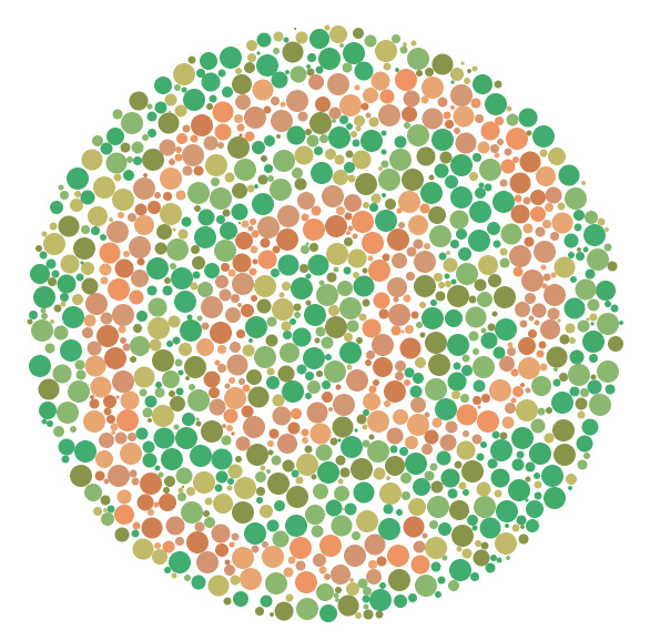
 Have you ever known anyone with color blindness? I have a relative who has this problem and I must admit I used to tease him when we were kids. I didn’t understand why he didn’t see colors the same way I did, I just thought he hadn’t learned his colors. Of course, I feel bad as an adult for the teasing, but now I understand more than I did back then. Although I do not suffer from color blindness, I realized that many of my typography projects had the potential to be viewed by people who do have this affliction. I had to find ways to be sure they could perceive my work as it was intended.
What is Color Blindness?
Color blind people do see colors; they do not usually see the world in shades of gray. Color blindness is the inability to distinguish certain colors, or the differences between colors. This is the result of a lack of color pigment in the cones of the retina of the eye. A person who is color blind may have trouble seeing red and green, or blue and purple. Depending on the severity of the color blindness, these colors may even look the same to a color blind individual. You do not get color blindness; you are born with it, and most likely inherited it. More men than woman are color blind and it is a fairly common occurrence – 1 in 12 for men and 1 in 20 for women. There is a very small group of people who suffer from red monochromacy or achromacy. This rare type of color blindness leads to seeing the world in gray and black because the cones in the retina do not work at all.
How Do You Design for Color Blindness?
It is important to be certain that, whatever your design, you don’t rely just on colors to get your message across. Use an assortment of visual cues that will allow all viewers to understand the point you have made. You can do this by including an explanation of your image in the text. This will allow those who can’t easily see all of the color cues the same information as those who are not dealing with color blindness. Because reds and greens are the most indistinguishable to a color blind person, be certain that if these are your main colors, an explanation is included. When choosing your colors, bear in mind that while a color blind person may not correctly identify every color, using different shades will allow them to see a difference. If you choose a bright green and a dark red the differences will be more apparent. Two dark or two bright colors would be much harder to distinguish.
Charts
Designing charts with color blindness in mind is important. If you choose the wrong colors, you will have worked to create a chart that can’t be read by your color deficient associate. If, for whatever reason, your colors have to be close in brightness, be sure to add some texture. For instance, add some lines to the graphics to make the appearance different in a quick and easy way. This will make it a more readable chart for everyone.
In the long run, it is not about what color you use in your design. It won’t make much of a difference if a user thinks your background is brown, when in reality it is a dark red. What matters is that it is a useable and understandable piece of work. Add enough contrast to make it readable, and add enough symbols, texture and shadow to make it interesting. All of those accessing your work will thank you.

