March 10, 2014

By Janelle Sullivan
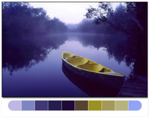 There is a wide variety of Web tools available for use when you are planning the color palette for your next project. You may have a color scheme in your mind before you start, or you may not have a clue what direction you want to head in. Either way, I have found these web tools to be invaluable when I am trying out new color schemes or I am doing a job for someone with an unusual plan for a color scheme. I hope you find them to be helpful, too. There is a wide variety of Web tools available for use when you are planning the color palette for your next project. You may have a color scheme in your mind before you start, or you may not have a clue what direction you want to head in. Either way, I have found these web tools to be invaluable when I am trying out new color schemes or I am doing a job for someone with an unusual plan for a color scheme. I hope you find them to be helpful, too.
Color Blender
 Color Blender is an easy-to-manipulate tool that can help you choose color schemes for almost any purpose. You might be creating a typography project, planting a flower garden, or painting your bedroom. Whatever you are planning, this tool allows you to select a color and automatically get a color palette of complementary and contrasting colors. (more…) Color Blender is an easy-to-manipulate tool that can help you choose color schemes for almost any purpose. You might be creating a typography project, planting a flower garden, or painting your bedroom. Whatever you are planning, this tool allows you to select a color and automatically get a color palette of complementary and contrasting colors. (more…)
March 5, 2014

By Janelle Sullivan
 Before you start saying, “Oh no, the crazy lady is talking about typography again,” let me remind you how important this subject can be. I can agree that not everyone gets as excited as I do about typography, but in some cases, it can make or break your project. With that in mind, let’s talk about a few things to keep in mind before you start your first typography project. Before you start saying, “Oh no, the crazy lady is talking about typography again,” let me remind you how important this subject can be. I can agree that not everyone gets as excited as I do about typography, but in some cases, it can make or break your project. With that in mind, let’s talk about a few things to keep in mind before you start your first typography project.
What is Typography?
Very simply, typography is the act of setting type in your project and the techniques you use to do so. It is not only the words that are used that are important to any project. It’s also the way those words look in the finished work. Are they readable? Are they well-placed? Is the point of the work clear to everyone who looks at it? Well-done typography will allow you to answer “yes” to all of these questions. (more…)
February 27, 2014

By Janelle Sullivan
 Are you a graphic designer searching for ways to create a poster that will capture the attention of your audience? Poster design has been plaguing artists since the invention of the printing press. Finding just the right mix of images, colors and words to deliver the message you are hoping to impart can be difficult. I guess that is one of the tricks of graphic design. There are a lot of tips out there regarding how to make the perfect poster. I am going to try to sort through them and see if I can find the ones that work the best. I will throw in a couple tips of my own that have helped me with poster design. Are you a graphic designer searching for ways to create a poster that will capture the attention of your audience? Poster design has been plaguing artists since the invention of the printing press. Finding just the right mix of images, colors and words to deliver the message you are hoping to impart can be difficult. I guess that is one of the tricks of graphic design. There are a lot of tips out there regarding how to make the perfect poster. I am going to try to sort through them and see if I can find the ones that work the best. I will throw in a couple tips of my own that have helped me with poster design.
What Do You Want Them to See?
In order to make an attention getting poster, you have to know what you want your audience to see. Make sure that the most important piece of information is what pops out from your poster. Whether that means making it the biggest or the brightest part of your graphic design, just make sure it pops. (more…)
February 17, 2014

By Janelle Sullivan
 When you spend time working on your art, or your passion, as I prefer to call it, you want the end result to be perfect. Whether you are a typography nut like I am or maybe you are into posters (oh wait, that’s me, too), there is a certain amount of bliss involved in seeing your project finished. It can be confusing, though, to know which paper will be the exact right choice for what you are trying to achieve. I find myself doing a little research every time I am ready for either typography printing or poster printing, just to be sure I am heading in the right direction. Maybe when I’m done here, we will all have a better understanding of paper types and how to use them. (more…) When you spend time working on your art, or your passion, as I prefer to call it, you want the end result to be perfect. Whether you are a typography nut like I am or maybe you are into posters (oh wait, that’s me, too), there is a certain amount of bliss involved in seeing your project finished. It can be confusing, though, to know which paper will be the exact right choice for what you are trying to achieve. I find myself doing a little research every time I am ready for either typography printing or poster printing, just to be sure I am heading in the right direction. Maybe when I’m done here, we will all have a better understanding of paper types and how to use them. (more…)
February 12, 2014

By Janelle Sullivan
 There’s nothing more disappointing to me than when I print my digital art and the outcome is less than I expected. You know what I mean: Based on your printing techniques, I am sure there have been times when you have not been happy with the hard copy of your digital art. I have discovered that there are some tricks you can use when printing digital art to ensure a beautiful final product. Crisp, clear colors and well-defined subjects will please the artist in each of us. There’s nothing more disappointing to me than when I print my digital art and the outcome is less than I expected. You know what I mean: Based on your printing techniques, I am sure there have been times when you have not been happy with the hard copy of your digital art. I have discovered that there are some tricks you can use when printing digital art to ensure a beautiful final product. Crisp, clear colors and well-defined subjects will please the artist in each of us.
Proof Your Work
Whatever you are printing, I am sure you’ll want it to be the best possible reproduction of your work. So how can you be sure that you will get what you want? You’ll need to proof your work. Start with an artist proof. Print your image and see if it is what you are hoping for. Are the colors what you were hoping for? Is the image clear and crisp, or soft and mottled, just the way you intended? Once you’re holding a hard copy in your hand, you will be able to see what, if anything, needs to be tweaked. Just be sure to proof using the same paper and printer model that you will use for your final print. This is the only way that you will achieve consistency in your prints. If you are printing digital art images in larger quantities, you might choose to make a contact sheet instead. Thumbnail images, several to a page, allow you to save some money and time. I’m not a big fan of the contact sheet, though, because I find it harder to see all of the details of each picture in such a small format. (more…)
January 31, 2014

By Janelle Sullivan

If you are an aspiring artist, you have probably learned how difficult it is to achieve fame. To me, my art is very personal. When I started painting, it was painful to me if everyone wasn’t as excited about my work as I was. I realized, eventually, that if I was happy with what I produced, it didn’t matter what anyone else thought. I will never be Georgia O’Keefe and I am OK with that. That being said, many artists never acquire the fame they hope for in their lifetime – not even Van Gogh – but, let’s see if we can come up with a method to get some extra attention.
How can I get noticed?
In order to have your work seen by the “right people” you have to get out there and make connections. Go to art studios and talk to the owners, and the customers, if the owners will allow it. Go to every art show you can find. Look at the work that is being sold at these shows. I will never suggest you change your style of painting just to make people buy your work. Your art should be an extension of you, and you should always stay true to who you are; but, being aware of what is being created and what sells in a certain area can help you find the right spot for your artwork. (more…)
January 24, 2014

By Janelle Sullivan

I used to love the day the new phonebooks would arrive. I loved opening it up and looking for our name and phone number. I would feel so grown up when my mom would ask me to look up a number for her. And then there were all those other uses for phonebooks; like a booster seat when my hair needed a trim or a great step up for Mom’s step aerobics. Slowly but surely the phone book has faded away. I don’t have one in my home at all. I have opted out of receiving one, in the interest of saving paper, as I wouldn’t use it, anyway. (more…)
January 21, 2014

By Janelle Sullivan

I love color! I am captivated by the way colors interact in a garden, a painting, or even a rack of sweaters in a department store. It intrigues me when I look in my friend’s closet and see all of her clothes organized by color. But my closet, with its chaotic array of colors, makes me smile. My mom always says it is my artist’s soul that allows color to bring me such pleasure. She may be right but I think everyone reacts, in some way, to color. It has been proven to have an effect on both your behaviors and your emotions.
Color and Your Mood
When we talk about your mood, we are referring to the quality of your feelings at a specific time. How can color affect a person’s mood? Different colors can elicit very personal feelings in individuals. Often, these feelings come from past experiences, or the culture you were raised in. In our society white is worn for weddings, as a symbol of innocence and purity. In some Eastern cultures white is the color worn for mourning, therefore it is the color associated with grief. Cool colors, such as blues and greens, are considered calming. Warm shades, like red and orange, evoke feelings of warmth and comfort for some, but hostile, angry feelings in others. Scientists have not done large scale research on color and its effect on people, so there is not very much empirical evidence to prove the theory. What remains is a lot of anecdotal evidence on color and human mood and emotion. My favorite color is red! If I want to feel vibrant and in charge I will wear my favorite red sweater. It seems to boost my mood and my confidence at the same time. I guess that is my contribution to anecdotal evidence. (more…)
January 15, 2014

By Janelle Sullivan

Vincent van Gogh was born 1853 and left this world in 1890 at the very young age of 37. I can’t imagine that there are very many people who have never heard of van Gogh. This is not a name that would only be recognized by art aficionados, but rather by most everyone. That means Vincent van Gogh would be classified as a famous man. And we all know that famous people are rich and live fabulous lives, right? Not so at all. Van Gogh’s story is a monumentally sad story that could definitely leave you in tears. You may know his paintings but I would like to share some of his story with you.
Who Was Vincent van Gogh?
Van Gogh was born in the Netherlands and was the son of a Dutch Protestant minister. He was raised believing that he would follow his father’s footsteps and serve humanity with a religious calling. Vincent put his entire being into becoming the theologian that his father was, but was unable to achieve this goal. He had a tendency to be very single minded with everything he attempted and was prone to burn out followed by failure. Vincent van Gogh was a truly tormented man who saw himself as a failure in all that was important to him, both in his career and his personal life. (more…)
January 6, 2014

By Janelle Sullivan

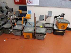
I always thought transparencies were the coolest things. Imagine printing something on a clear film and then being able to project the image on the wall for everyone to see. The overhead projector, with its light bulbs, mirrors and lenses was once considered the height of technology. Transparencies were used in classrooms as a way of sharing images or problems with an entire classroom full of students. Even major airlines, such as Boeing and Beechcraft, used transparencies to review designs with their engineers. But transparencies are joining a large group of obsolete printing technologies that are being replaced by more modern technologies. (more…)
« Previous Page — Next Page »
« Previous Page — Next Page »
|
|
 There is a wide variety of Web tools available for use when you are planning the color palette for your next project. You may have a color scheme in your mind before you start, or you may not have a clue what direction you want to head in. Either way, I have found these web tools to be invaluable when I am trying out new color schemes or I am doing a job for someone with an unusual plan for a color scheme. I hope you find them to be helpful, too.
![]() Color Blender is an easy-to-manipulate tool that can help you choose color schemes for almost any purpose. You might be creating a typography project, planting a flower garden, or painting your bedroom. Whatever you are planning, this tool allows you to select a color and automatically get a color palette of complementary and contrasting colors. (more…)
Color Blender is an easy-to-manipulate tool that can help you choose color schemes for almost any purpose. You might be creating a typography project, planting a flower garden, or painting your bedroom. Whatever you are planning, this tool allows you to select a color and automatically get a color palette of complementary and contrasting colors. (more…)

